Lloyds Chatbot screenshot walk-through
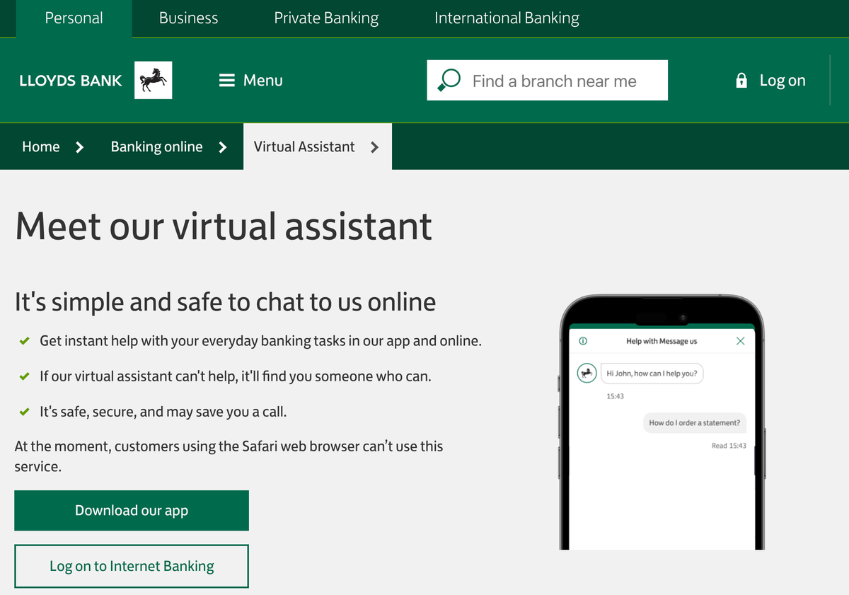
Building on my previous post, several of you asked to see the Conversational AI / chatbot screenshots showing the Lloyds Bank Virtual Assistant in use – but in static form, rather than video.
So here we go....
Lloyds Bank - quick overview
Lloyds is one of the largest financial services players in the United Kingdom. Because it's one of the top 4 banks in the country, it's enormously significant in the marketplace – something like roughly a quarter of all UK bank transactions go through Lloyds systems. It's a huge Retail bank, but also offers comprehensive Commercial banking services along with Insurance, Pensions and Investment offerings.
According to their 2023 annual report, the bank has a whopping 27 million customers, of which 21M are digitally active. They made an underlying operating profit of almost £8 Billion on revenues of almost £18 Billion.
The name: Virtual Assistant ("VA")
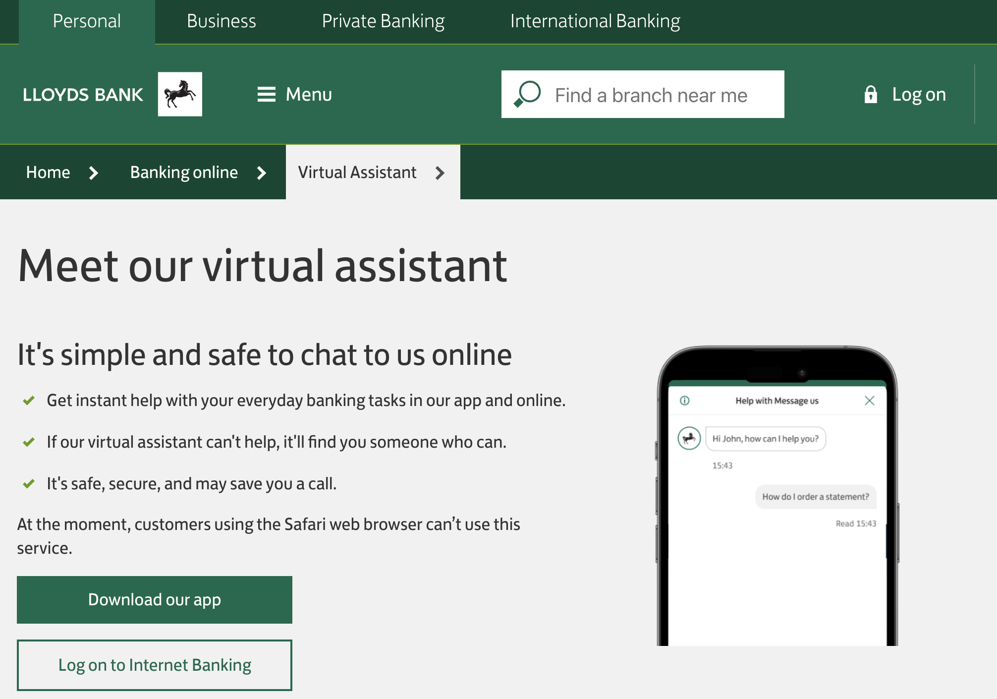
Lloyds Bank hasn't given their VA ("virtual assistant") a name. They've opted to keep it generic. I think this fine – my preference is some kind of name as it's much easier to refer to "Cora", "Nova", "Libby" or similar, rather than "the virtual assistant" or "the chatbot". Just my preference.
The Welcome Screen
I've tapped to open up the chatbot screen...

Note the second point above: "Keep your query to 15 words or less."
I understand technically why they have included this – but I think it could be rephrased. Imagine phoning the Lloyds call centre and being told to keep your query to 15 words or less?
The First Welcome Message
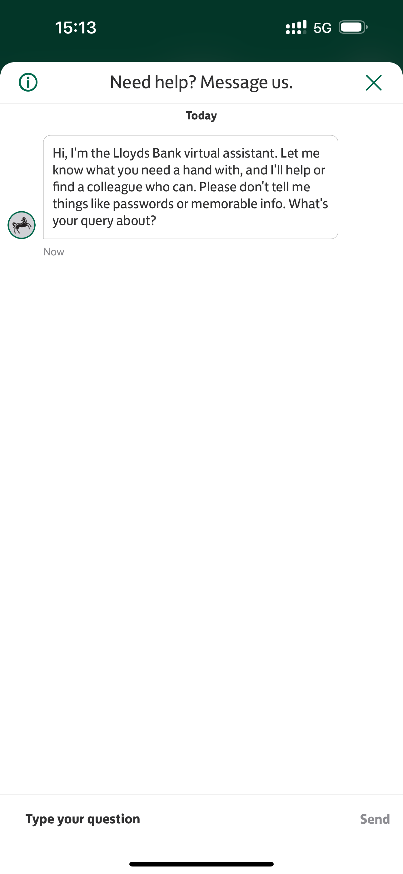
Here is the first think you see when you start interacting with the VA.
I think it's right that they're reminding customers to avoid sharing passwords or memorable information. So, let's get into it...
My Question
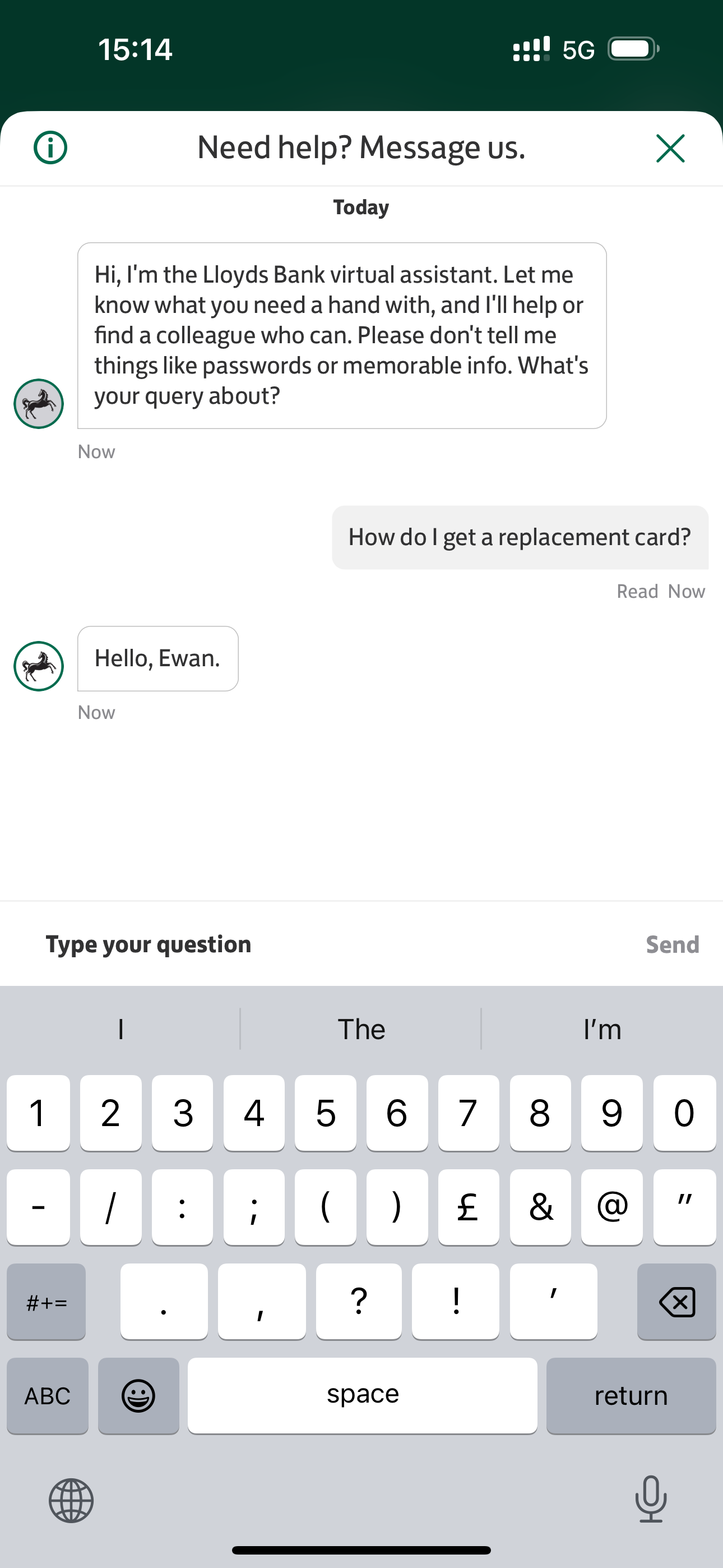
You can see I've kept it nice and simple. 7 words: "How do I get a replacement card?"
You can then see the VA greeting me. This is good and expected - probably pulling that data field from the authenticated environment.
The VA's Response
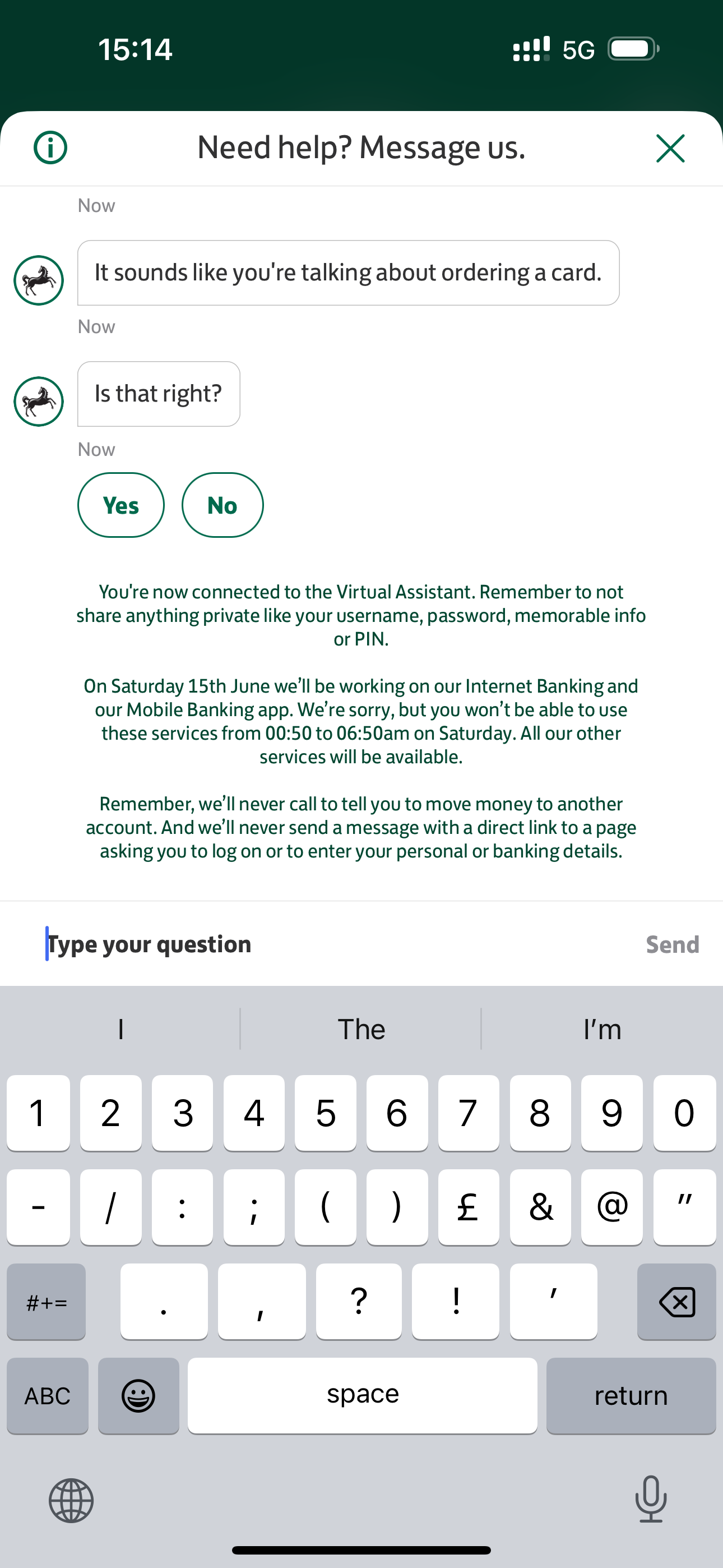
No surprise, the VA correctly identified the fundamental intent and is checking with me.
I think this 'checking' stage is useful. In the fullness of time I'd ideally like it to go straight to the next stage, rather than having to check.
But I think this is perfectly acceptable.
Can you see the text below? I was somewhat confused by why the Lloyds team have decided to tell me – in the middle of a conversation – that they're having to switch Internet Banking and Online Banking off over the weekend.
Why is this here? I can guarantee that the Lloyds Bank call centre agents aren't interrupting the conversation with customers to say, "By the way, on 15th June...".
I think this is the wrong place to be displaying that text.
Answering Why
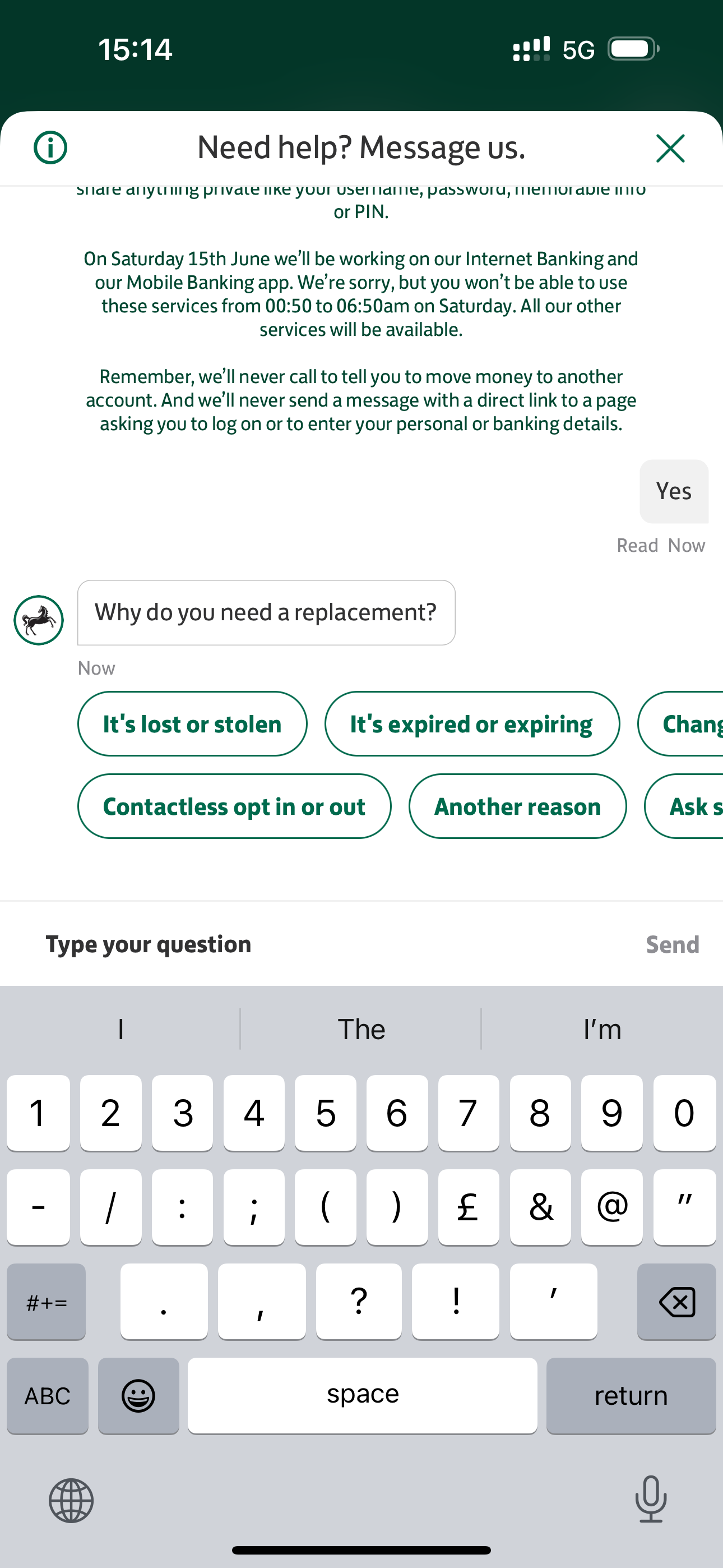
Almost every bank asks "why" when you say you need a replacement card. This is arguably not needed, but it's important to check if the customer has lost their card... or worse, if the card has been stolen. There are some fraud issues that need to be addressed here. So this is why the VA is asking this question.
Can you see that "On Saturday 15th June..." messaging? It's really interrupted the flow and forced me to read it.
Damaged Card
I selected "Damaged card" from the list and sent that off to the VA to think about:

The Resolution Stage
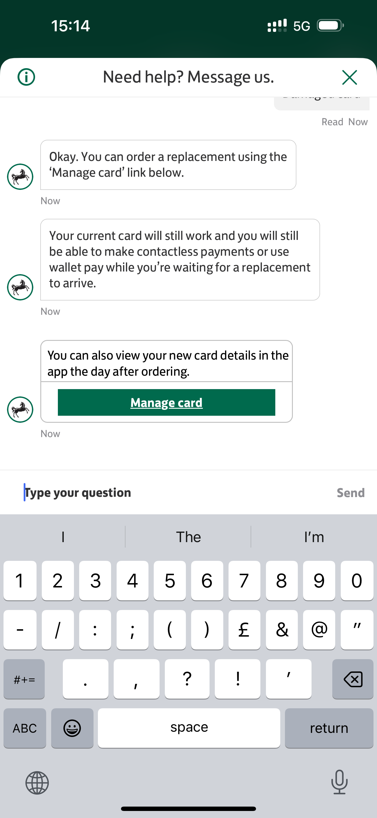
So here is where the magic happens. The VA has understood my request and is now in the process of fulfilling it.
It would be absolutely ideal if this was the execution stage.
The VA has now established my card is damaged and I want it replaced.
The most mature Conversational AI implementations have some degree of orchestration and integration to enable them to call the relevant internal APIs and execute the request at this stage.
Lloyds does not yet offer this.
So now it's time for me to do some work.
The VA sends a few helpful background messages and then provides me with an embedded "Manage card" link.
Manage Card Screen
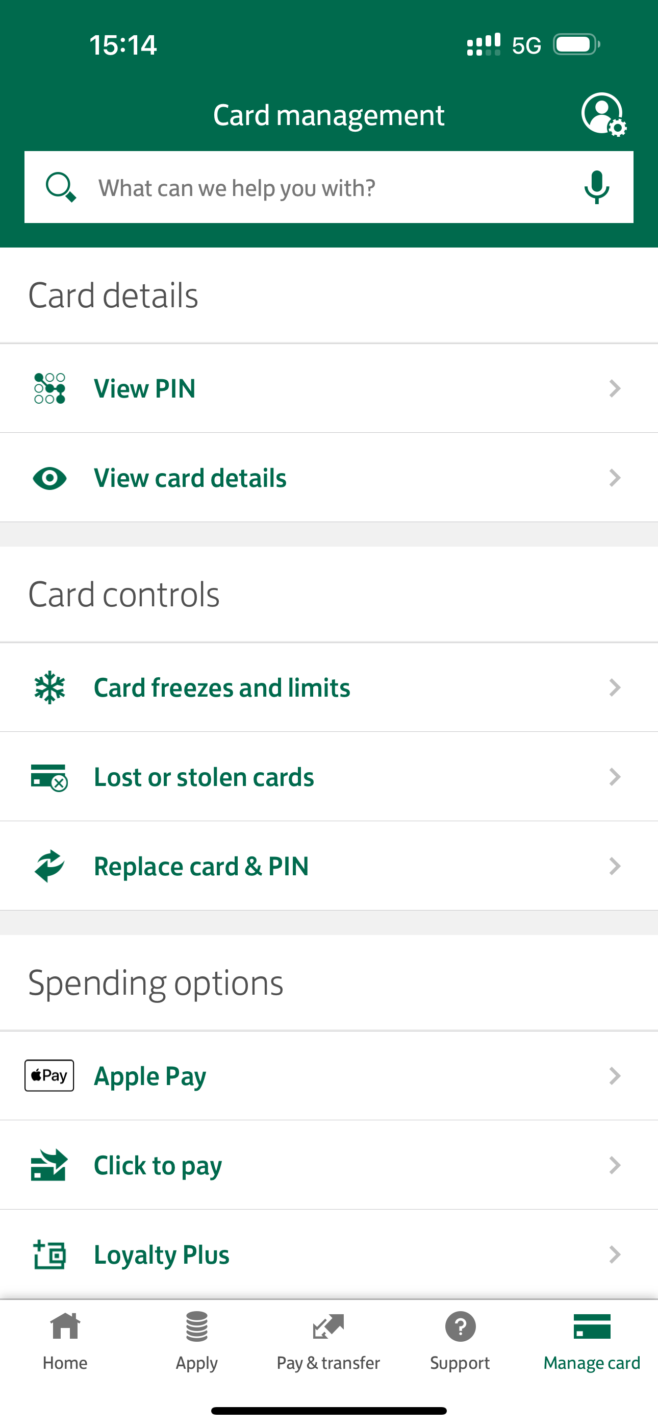
I tap on the Manage Card link. This opens a screen in the existing app - so, a deep link essentially, and sends me to the app's Manage Card screen.
I found this really confusing.
I didn't know what to do when the screen popped up.
I was expecting to press a 'order new card' button - or something like that.
I had about 10 seconds of confusion whilst I clicked through various screens until I realised - duh - that there was a 'Replace Card' menu item.
It would have been much more convenient if the VA had linked me directly to the Replace Card screen which I'll show in a moment. Sending me to Card Management and then making me find the relevant link is sub-optimal.
The Card Replacement Screen
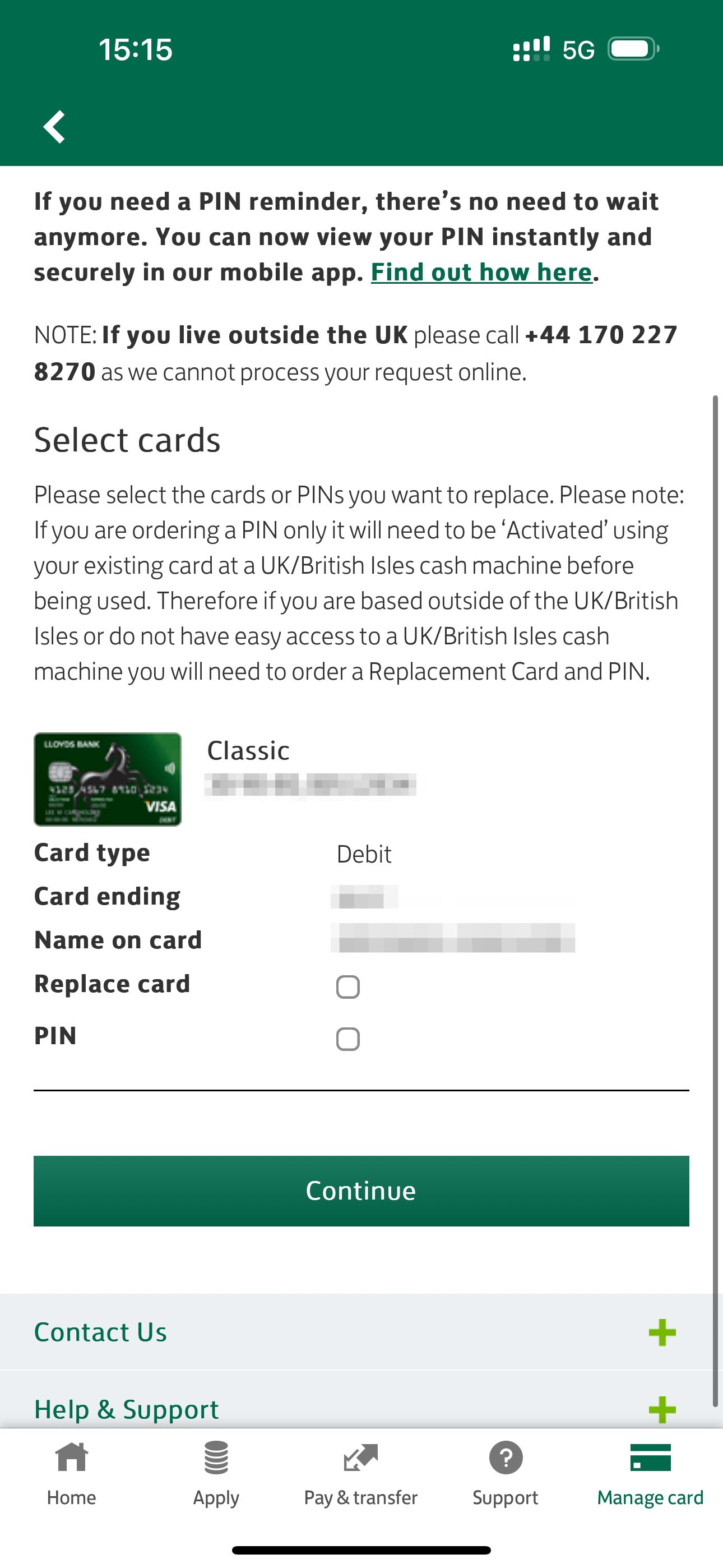
Now I've arrived at the right screen, you can see it's pretty straight forward.
I assume you press the Continue button and the new card is ordered.
There are some additional options here that I have to select - for example, do I want a PIN reminder. And if I had multiple debit cards, I could have selected the relevant card here, I think.
I didn't execute the transaction because my debit card is functioning perfectly fine. I hope this is the last screen in the process.
Were You Able To Make It Work?
I wanted to draw your attention back to the Lloyds VA.
Look for the last message. It's partially hidden.
This message popped up after I'd tapped the link (I think). Or there was a time delay before the message was sent.
I've highlighted it in red below...
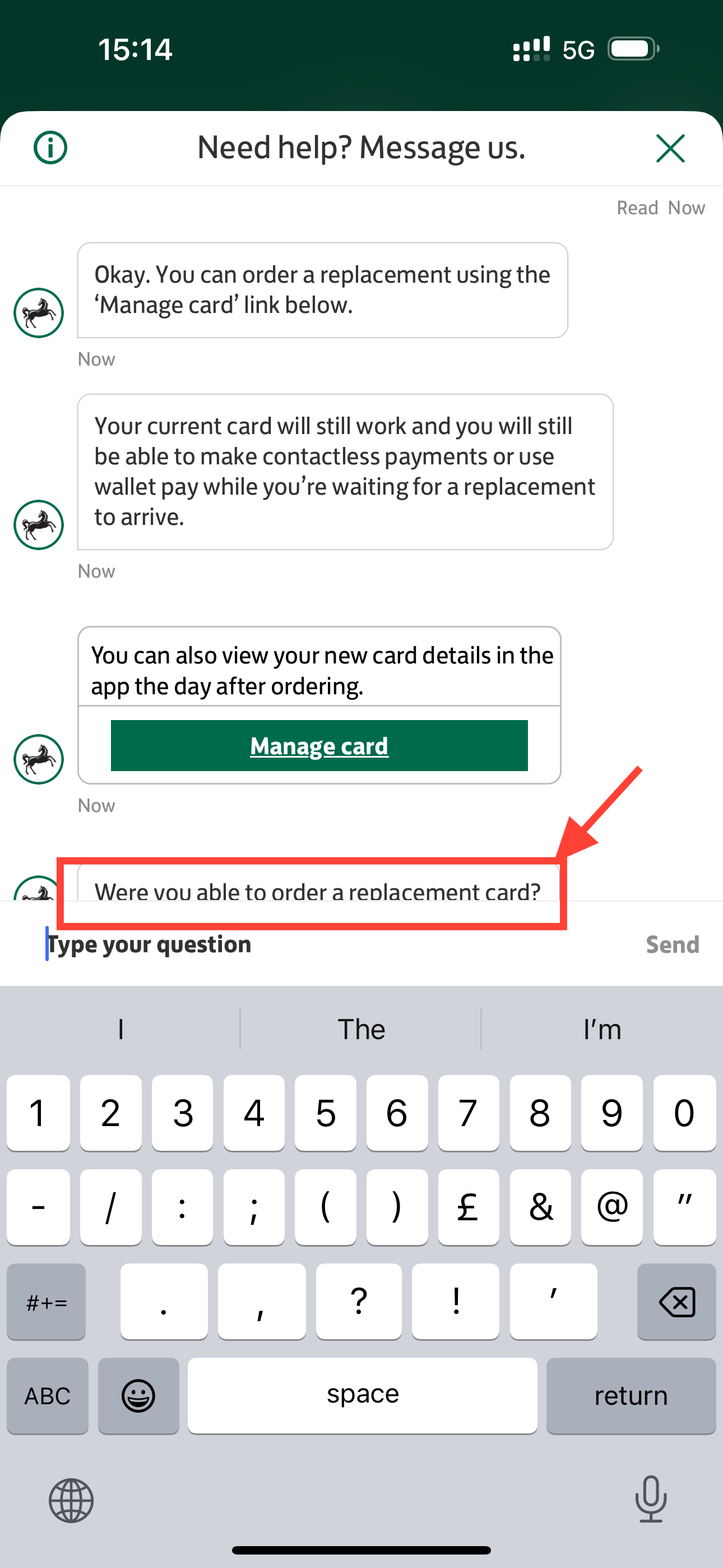
Were you able to order a replacement card?
Why are you asking, Lloyds?
This is also a sub-optimal experience that highlights the disconnect between the stand-alone VA and the rest of the bank's infrastructure.
I am curious as to what the VA would have done if I had clicked "No"? Would it have sent me back to the start of the intent? Handed me off to a human?
The need to ask the customer "did it work?" highlights that, fundamentally, there's a lot to do to increase the integration capabilities of the end-to-end technology stack (potentially including the chatbot technology too).
Summary
As you can see from the timestamps on the screenshots, this whole process was perhaps 60-odd seconds, maybe 120-seconds maximum.
What was good:
- Lloyds offers a VA so I was able to use chat asynchronously
- The VA resolved my issue satisfactorily
- The process was quick
- I completed my task (well, I could have by pressing the Continue button)
- I didn't have to phone the call centre
What could be even better:
- The downtime message was unnecessary and poorly placed
- The 'deep link' in the app took me to the wrong screen – in my view - maybe this is a technical limitation. I think it should have taken me directly to the Card Replacement screen, not the main Manage Card screen.
- I would have preferred that the VA executed the request on my behalf, rather than sending me hunting through more screens to press more buttons
- I am bothered that the VA asked me if the process worked - I don't think that looks good
- I don't like the anonymity of the "Virtual Assistant" but I should highlight this is just personal preference. I will need to look and see if there is any research around whether a VA should be 'named'.


