Conversational AI as the primary app interface? A simple example.
I've got quite a lot of travel coming up across the next half of the year.
I use a whole array of applications and services to help me do that – like most, I've got a specific set of workloads and processes for trying to optimise everything.
This afternoon I received a travel plan from one of the clients I'm working with. Generally speaking I buy my own travel, but in this case, both the client and I checked and they were able to get better rates because of their bulk airline deal.
So they booked the flight and they sent me the details.
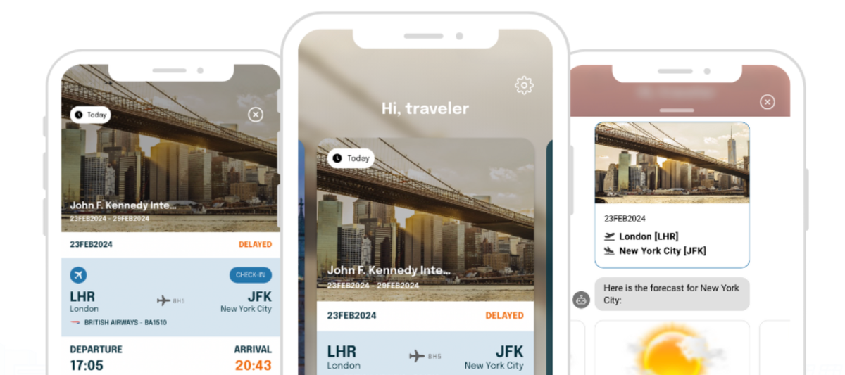
It came with a link to Checkmytrip.com (from travel technology expert Amadeus).
You've seen similar, I'm sure. Many corporate travel agents will use something like Checkmytrip or similar to help employees manage their trips.
I thought I'd try out Checkmytrip. I hadn't tried the app before.
I downloaded it and found it super smooth. Here's the first screen:
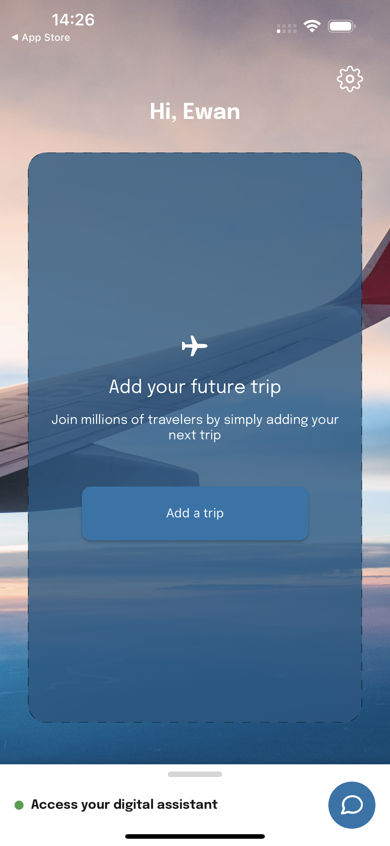
There was essentially one button! That's right, a super simple interface.
My attention, however, was drawn to the "Access your digital assistant" section art the bottom.
I tapped.
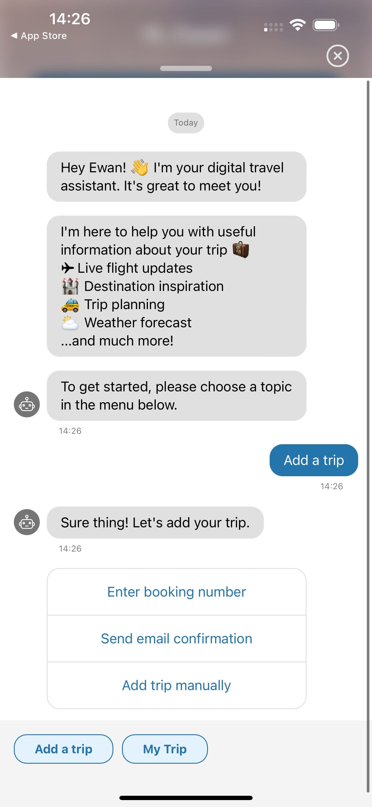
Although this interface is not new to me, I found it surprisingly compelling.
In fact, I'd go so far as to say I found it rather comfortable. Perhaps because I use a lot of chatbots?
As I played with it, I quickly recognised that it's not necessarily Conversational AI, rather, it's a series of pre-defined decision-tree style approaches, but absolutely and wholly configured for a set of oft-repeated travel UX journeys.
I tried to get it to lookup the status of SK1501 - a flight I used to take a lot from Copenhagen to London. You can't because there's no free text input.
You have to add it as a trip.
So I did.
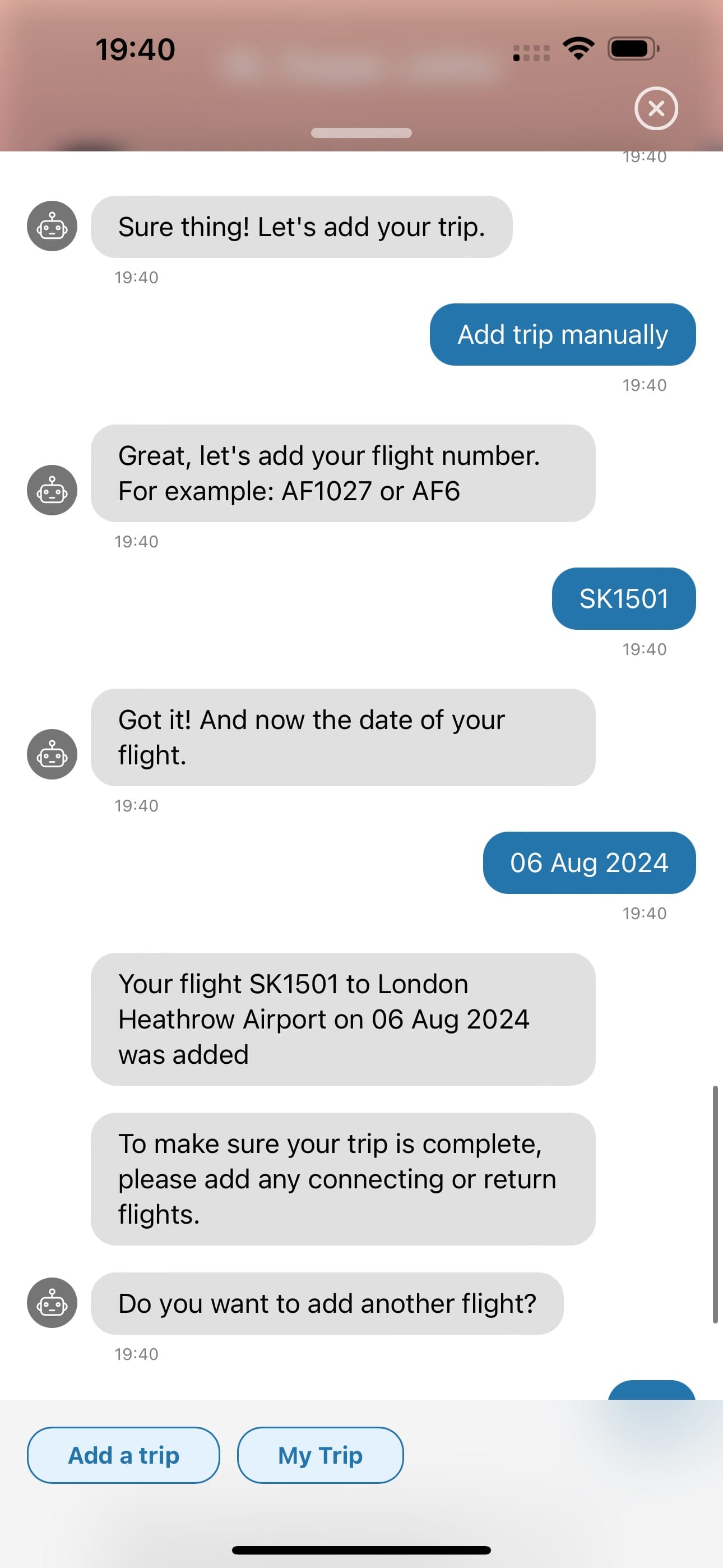
Then I selected the date.
This was really quick.
Do I need to add a return flight? No.
Done.
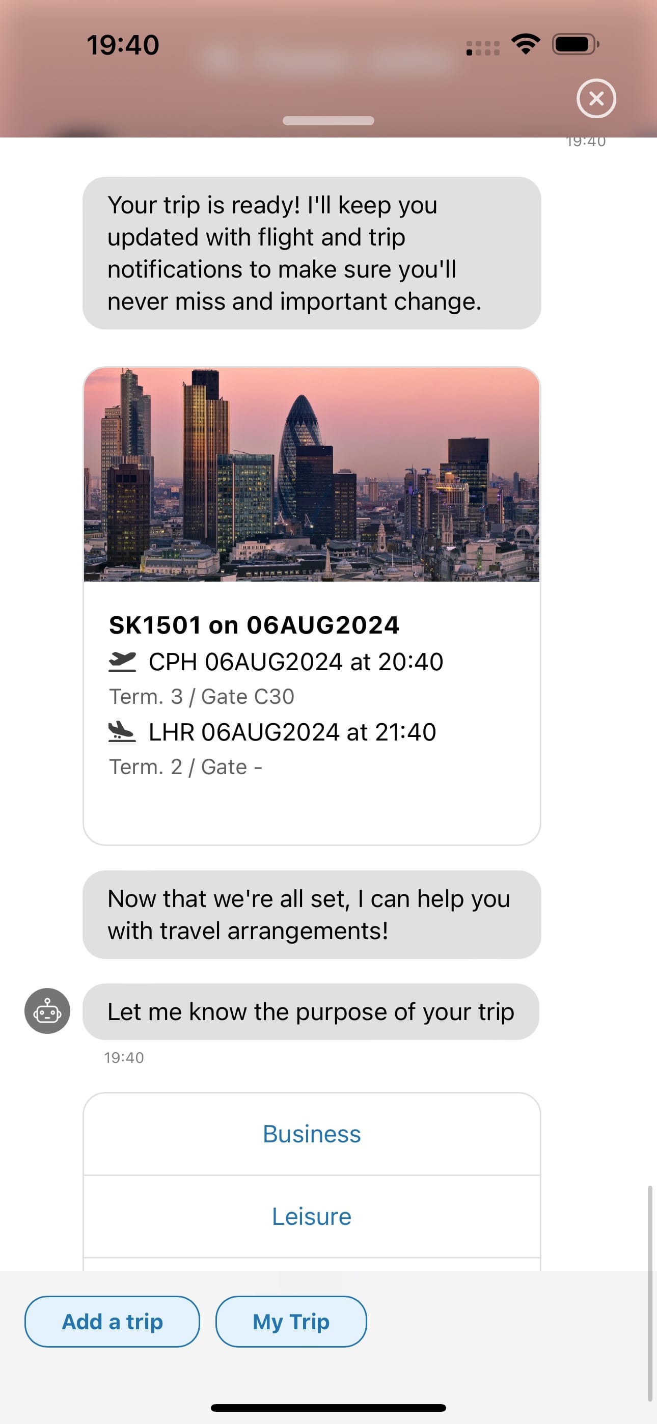
I then decided to play the game and selected "Business".
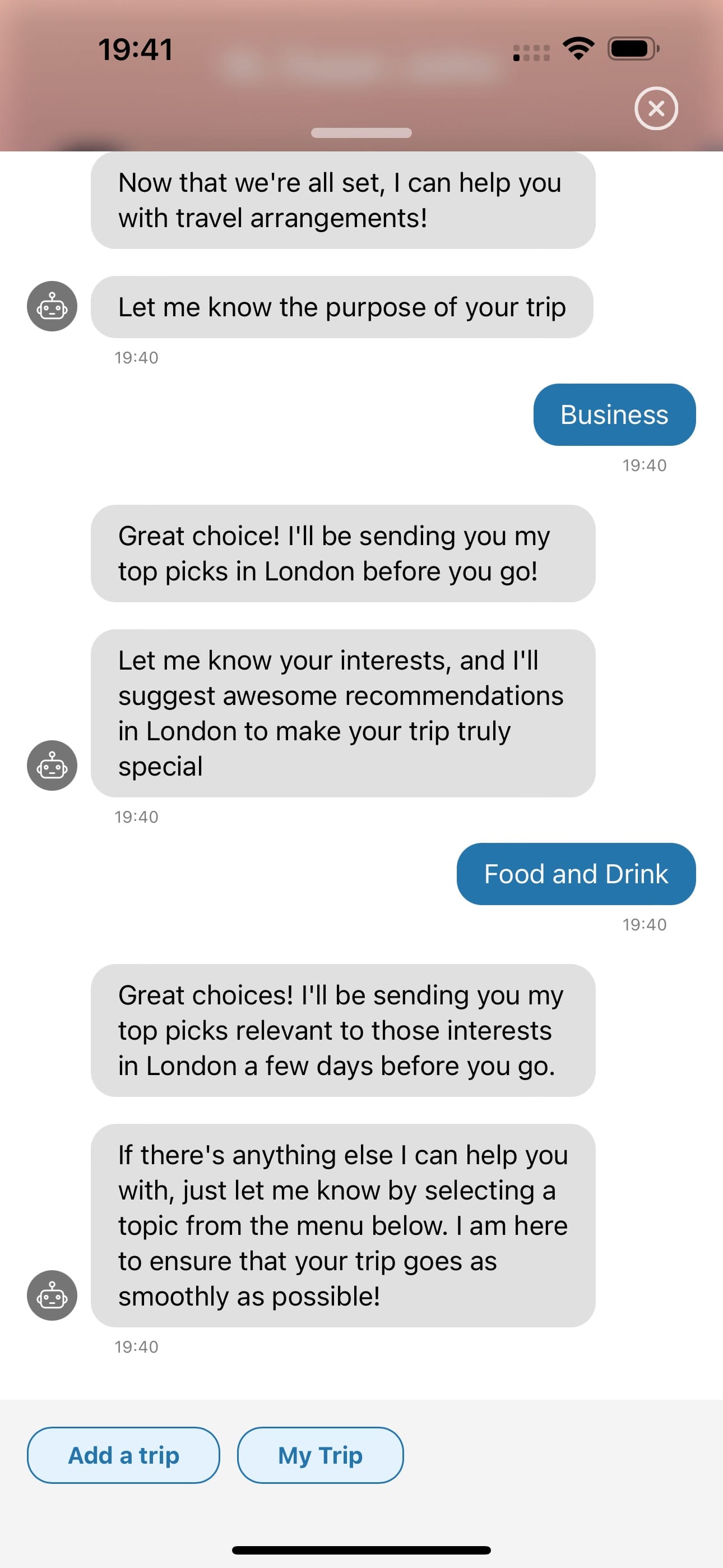
Then it asked me what was important to me.
I selected "Food and drink" and the Checkmytrip 'bot' is apparently going to send me some suggestions shortly.
So whilst I realise this isn't anywhere near as complicated or capable as many of the Conversational AI interfaces I am using regularly, nonetheless I felt it was worth recording this one.
I think we'll see more and more apps adopting this UX paradigm.
The clear, simple 'decision tree' approach is quite refreshing – especially when we as users are accustomed to having to try and rapidly learn a new 'UX interface' for so many new apps and services.
Just try ordering food from a rapid-delivery app in the UK, then in Oman, then in Saudi. The user experiences are completely varied because each is served by different leading apps (e.g. Deliveroo in the UK, Talabat in Oman, Hungerstation in Saudi), each with its own precise set of UX approaches.
When you boil it down to a text 'menu' – or text – you're forced to simplify, simplify, simplify.
What's more, the opportunity to add more features to the decision tree is, I would imagine, relatively straightforward (up to a point).
It will get even more exciting when my agent – my own personal AI – can begin to engage with these external 'agents'.
I think we'll see some fascinating times ahead.
In the meantime, nice work team Checkmytrip!


